
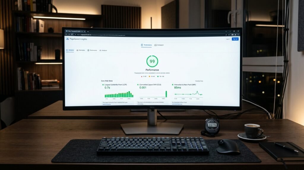
Every digital leader must understand how to optimize website speed to maximize user engagement and organic search rankings. In fact, research demonstrates that even a single-second rendering delay causes measurable drop-offs in commercial conversions. Furthermore, Google includes Core Web Vitals metrics directly in its search algorithms to evaluate real user page experience. Therefore, engineering high-speed digital architectures is an undeniable competitive necessity.
Understanding the Three Core Web Vitals Metrics
Google defines page experience around three foundational real-world user interaction pillars:
- Largest Contentful Paint (LCP): Measures perceived loading performance. To provide a good user experience, the main content or hero visual must render within 2.5 seconds of page initiation.
- Interaction to Next Paint (INP): Assesses overall page responsiveness. The interface must respond to user taps, clicks, or keystrokes in under 200 milliseconds without main-thread blocking.
- Cumulative Layout Shift (CLS): Measures visual stability. Pages must maintain a layout shift score below 0.1, preventing unexpected jumping of text or buttons while assets load.
Eliminating Render-Blocking CSS and JavaScript
The most common culprit behind sluggish LCP scores is render-blocking assets in the document head. When web browsers encounter external stylesheet links or synchronous scripts, they pause HTML parsing until those files download and execute.
To eliminate this bottleneck, inline critical above-the-fold CSS directly into the HTML document head. Meanwhile, defer non-critical stylesheets and scripts using defer or async attributes.
Furthermore, refactor oversized JavaScript bundles. Splitting monolithic scripts into dynamic, route-based chunks ensures that visitors only download the precise code needed to render the current viewport.
Image Optimization and Next-Gen Format Deployment
Heavy, uncompressed images are the primary cause of network congestion on modern websites. Always serve modern compressed formats-such as WebP or AVIF-which reduce file payloads by 30% to 50% compared to legacy JPEG or PNG files.
In addition, implement responsive image syntax using srcset and sizes attributes, delivering appropriately sized visuals for mobile, tablet, and desktop screens. For above-the-fold hero banners, set fetchpriority="high" to instruct the browser to prioritize the critical asset immediately.
Finally, always declare explicit width and height attributes on all image elements. Reserving layout dimensions in the DOM prevents Cumulative Layout Shift as images load progressively.
Explore our specialized high-speed cloud hosting and server solutions engineered for minimal TTFB. Additionally, discover our bespoke corporate website design and development services.
In conclusion, speed is not merely a vanity metric; it is a fundamental business engine. By taking systematic steps to optimize website speed, organizations deliver exceptional user journeys and secure lasting search advantages.
Ready to engineer a high-performance website for your enterprise?
Our engineering team in Al Khobar develops fast, natively bilingual websites and web applications tailored for Saudi business buyers and corporate bids.